By David Yamaguchi The North American Post

Photo DY
Prior articles in this issue addressing the topics of how the Japanese-language NAP was printed from the early 1980s through the late 1990s (typewriters) and the centrality of illustrations to effective print communication (“Seen and Unseen,” ) raise a question. How did the pre-war “North American Times” and post-war “North American Post” occasionally make and insert illustrations from 1902 through the 1970s? The latter period was the movable-type era of the Issei.
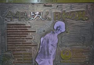
The answer to this question became clear to me during a reconnaissance trip publisher Tomio Moriguchi and I made to Anacortes in mid-2021 to examine what the Letterpress Museum there wanted to return to us from their overflowing museum. Then, co-owner Jeronimo Squires began passing us boxes of wood-and-metal advertisements laid into layouts. The best of these are Japan Airlines ads. An example is at right. Its image has been flipped left to right here for legibility.


